


1
2
3
4
5
6
7
8
9
10

ROLE: Branding, Information Architecture, UX & UI, Web Design
Squaredot is a Dublin-based Inbound Marketing Agency founded by Ian Blake, Jim Blake and Sean Sharkey. Their main problem was that Squaredot’s branding and website didn’t represent their overall vision for the company. I was asked to review the overall brand design starting from a conceptual point of view.
1. PREVIOUS WEBSITE
The first step was to understand the agency’s primary services and the way they were communicating these to their audience.
The key issues identified were the following:
• The website failed to communicate what the marketing agency does exactly.
• There was no clear understanding who their key target audience was. Were they aiming at marketing people or business owners?
• The usage of heavy-jargon in the website’s content was failing to get across their key messages and it didn’t lead users to take any action.
• The overall design was perceived as generic and unattractive.
• The lack of strong branding didn’t give Squaredot the necessary credibility from a client’s perspective.
Conclusion: The website and branding needed to be re-visited by identifying the company's main objectives and by defining their brand presence online.
2. CONCEPTING & EXPLORATION OF BRANDING
When approaching the brand itself, there was a need to define what the name 'Squaredot' meant and how it would be carried out visually throughout every application.
There was a whole graphical exploration with mood boards around the relationship between the dot and the square. What seemed interesting was this idea of of the dot morphing into to the square which gave the impression of constant evolution.
The interaction between these two shapes was carried out graphically throughout the whole brand. Users will note that in every animation and interaction, the dot will transform into a square and vice versa.
3. DESIGN PROCESS
During the design process it was essential to work out the key goals of the company with the Creative Director. One of the company’s most important objectives was to get their audience to 'Sign up to their Newsletter’ by making use of a Lead Magnet. This was essentially a free eBook that would contain valuable content for marketeers interested in learning more about the benefits of Inbound Marketing.
I proposed starting with an interactive landing page that would first introduce the eBook and as users scrolled down, we could then highlight the company’s own approach and methodology towards this type of industry.
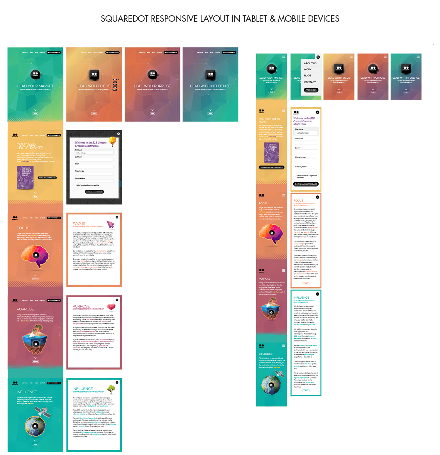
The second part was to design the company’s inner pages such as the ‘About’, ‘Work’, ‘Services’, ‘Blog’ and ‘Contact’. These needed to be clearly differentiated from the landing page and we opted for a more traditional format while still remaining true to the essence of the brand’s new look & feel.
KEY DELIVERABLES
• Design of the company's branding including usage of colours, fonts, illustrations and content on the website.
• Information architecture with sketches and wireframes.
• Designs for all screens with their responsive layouts.
• One-on-one meetings with the developer in order to ensure that the designs and interactions were properly adapted.
PRESS
Hubspot featured Squaredot in one of their Blog articles '18 Best Examples of Mobile Website Design'. They gave special praise to the website's overall simplicity, colour range and easy navigation. There was also a special emphasis on the 'Sign up to our Newsletter' form for the mobile experience.
CLIENT FEEDBACK
¨Melissa is a fantastic designer. One of the best I've worked with. Having worked alongside her for the best part of a decade I cannot recommend her strongly enough. Recently Mel designed the Squaredot website for me, demonstrating her imagination and creative flair. I'm more than happy to vouch for Mel and act as a reference. It also helps that Mel is a lovely person and a pleasure to work with.¨ Sean Sharkey, Creative Director at Squaredot.