


1
2
3
4
5
6
7
8
9
10
11
12
13
14
15

ROLE: User Experience Designer
Siro.ie is a joint venture infrastructure system from ESB and Vodafone created to provide regional Irish communities with the fastest broadband powered network of 1GB.
Although the website's initial role was to partner up with potential broadband providers, it eventually became more apparent that consumer awareness was also essential to its long term success.
1. ANALYSIS FROM CURRENT WEBSITE
The initial key issues identified were the following:
• There is no clear defined customer segmentation, so when reading the content on the site it doesn't make senses who is it they're talking to and how their offer will benefit users in their daily tasks.
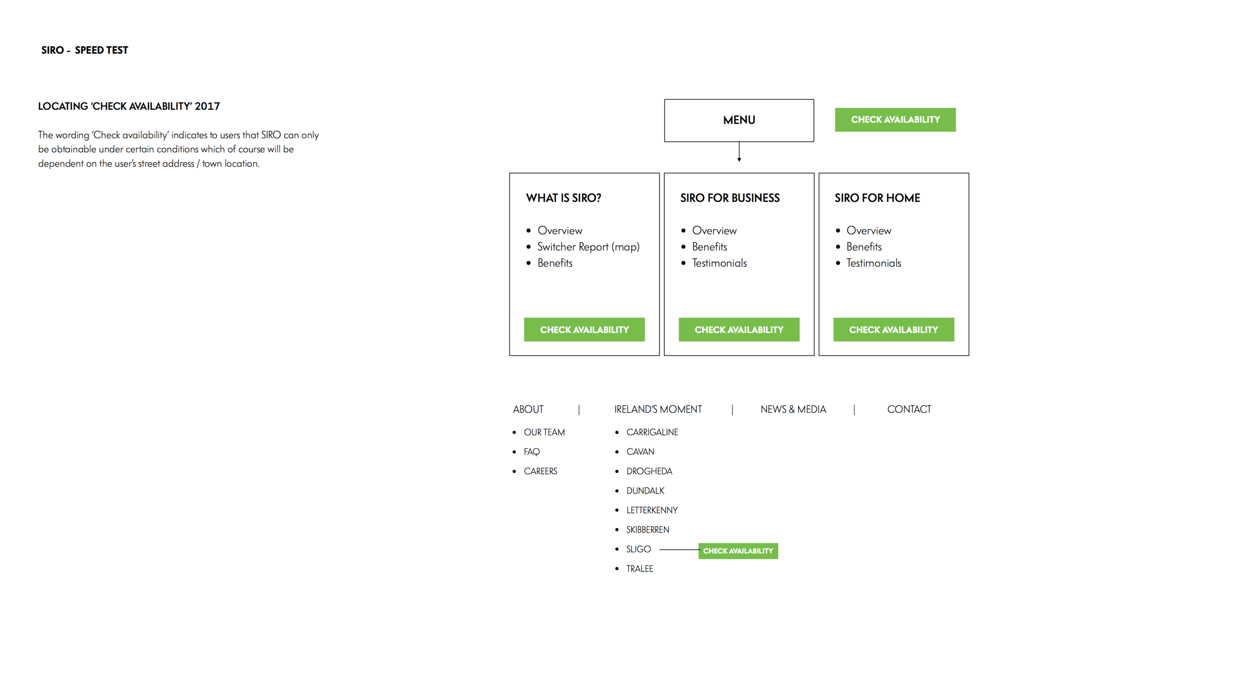
• 'Get SIRO' is the main call to action on the site which makes sense when the goal is to acquire new customers. Nevertheless, this call to action directs users to a geo-map, where they first need to type in their address and only then they can find out whether SIRO is available or not in their town. Unfortunately SIRO has only been rolled out in a couple of towns so far which means that most likely it's not readily available to users.
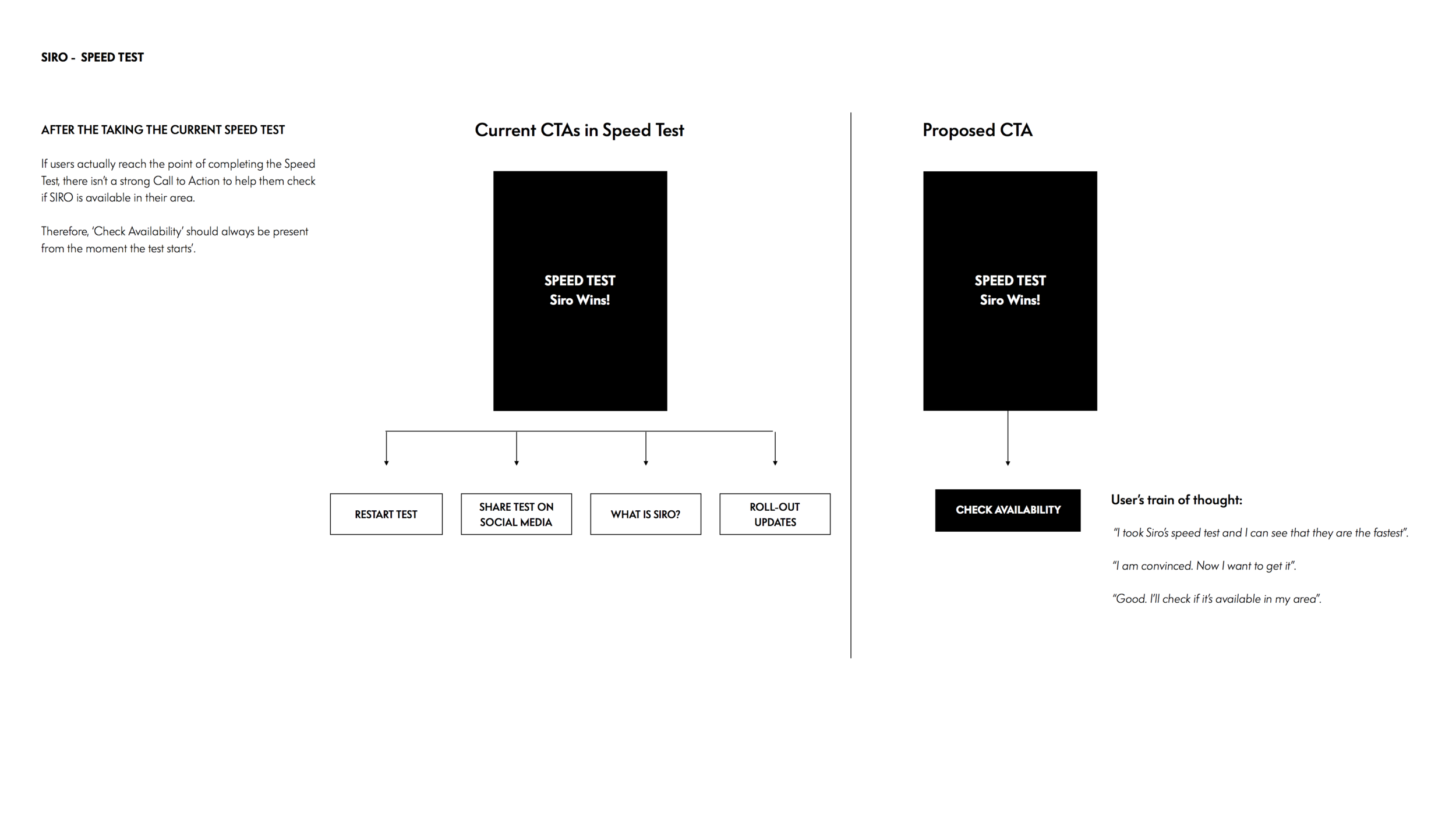
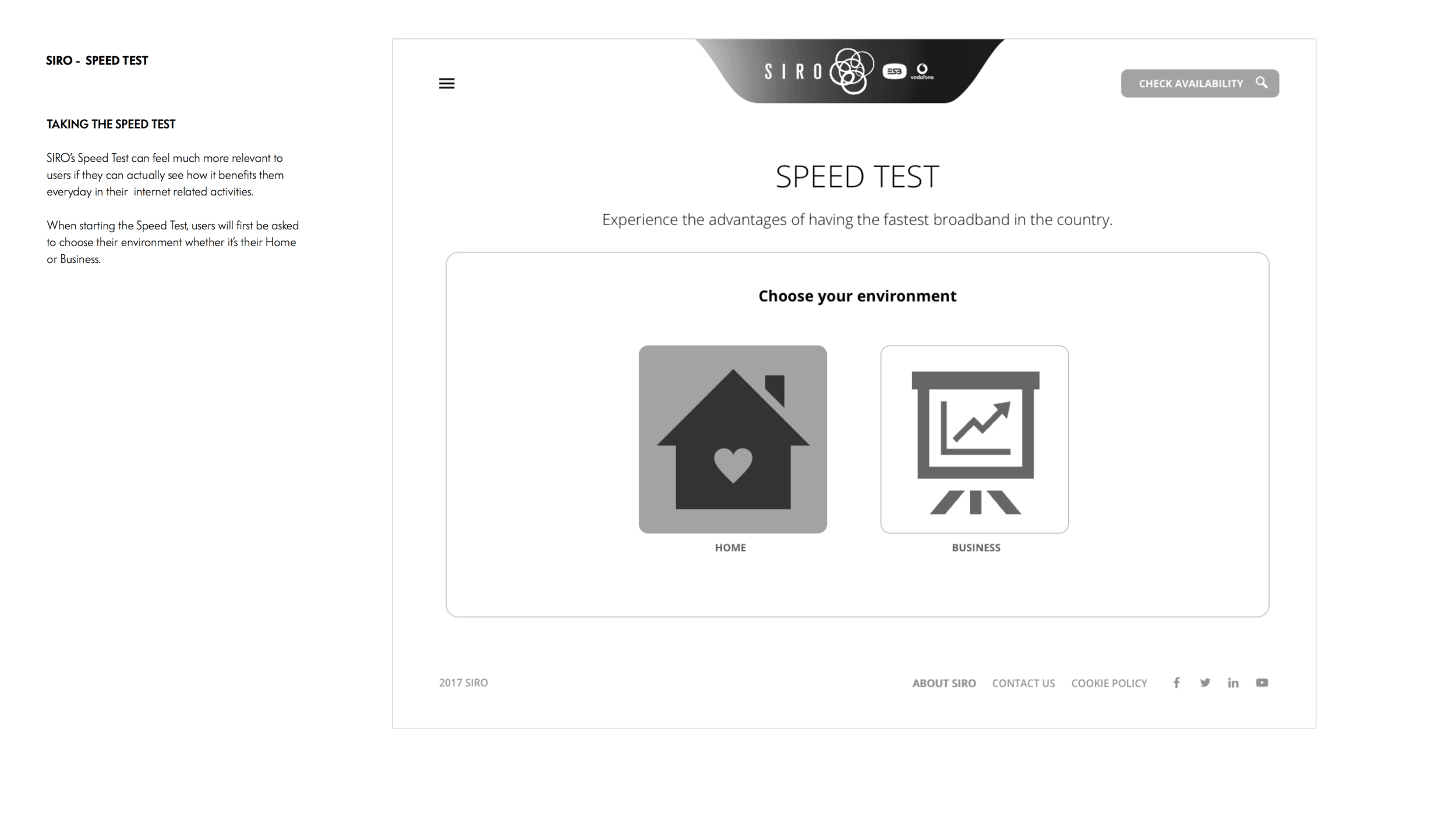
• The current speed test simulation on the site performs very poorly due to usability issues and lack of context.
• The individual town pages weren't really aligned to any type of content strategy, so when reading it, there's not true engagement from the local community.
2. UX SOLUTIONS
Although the agency is tackling functionality issues in three separate blocks, it was crucial to treat the project in a holistic way by going back to the information architecture of the site.
The following solutions have been delivered:
• Re-designing the Information Architecture to address new customers and making a clear differentiation between 'Home' and Business' segmentation.
• Identifying the main goals of each page based on how the technology could help people in their home or in their business.
• Re-thinking the concept behind the speed test process and instead of having it located in the main navigation in isolation it was placed as a one of the main call to actions in 'What is SIRO', 'SIRO for Home' and 'SIRO for business' pages. The core idea was to illustrate how SIRO's significant speed could help home owners and business owners in their daily tasks instead of having technical loading speed that weren't relevant to most users.
• Changing the main CTA from 'Get SIRO' to 'Check your Address' and then re-designing the process flow that will lead users to sign up in order to be notified when SIRO becomes available in their town.
• Aligning the town pages to fit the overall advertising strategy currently being rolled out in regional Ireland by dividing the town page's content in three phases: Create Awareness at a county level, Build Desire at a town level, Create Conversion at a personal level.
3. KEY DELIVERABLES
SIRO's key pages were wire-framed and prototyped in order to illustrate every user interaction
• High fidelity wireframes of SIRO's website key pages.
• Clickable Prototype to illustrate every user interaction plus a comprehensive design document that could help build the narrative from a user's perspective.
• Definition of new components that can fit the site's strategy.
CONCLUSION
The site's changes are currently being implemented in the staging phase and the updates are meant to go live on June 2017.
Once this happens, the main goal is to keep track of the site's performance and gather user's feedback on usability and content.
SIRO